Yoga Renaissance

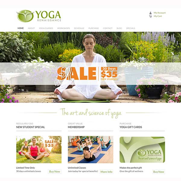
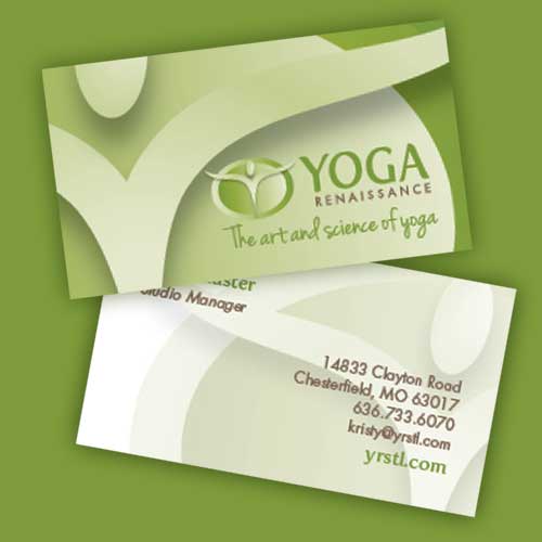

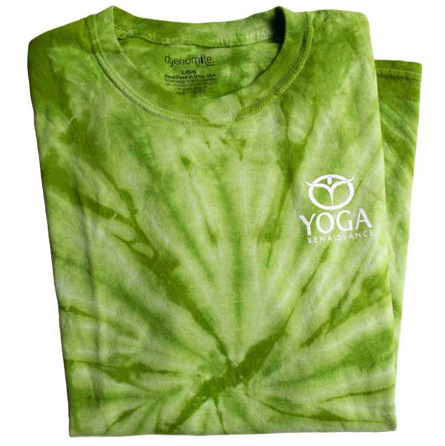

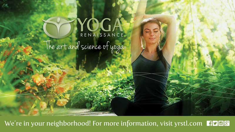

We had the opportunity to create a brand from the ground floor for Yoga Renaissance, a new concept studio in Town & Country, Mo. They brought a clear mission and passion — “to integrate mind, body and spirit through the art and science of yoga.” From there we created a logo that presented the idea in a direct, creative and artistic way. The brand mark transcends its space and represents the three-pronged mind/body/spirit wholeness. The organic and natural colors, as well as the flowing font were selected to communicate the authentic personality of the culture, while the classic, clean font for “renaissance” represents a distinctly Western approach to the practice, blending both contemporary and traditional font styles. This combination also reinforces the tagline, “The art and science of yoga.”
Additional graphic elements were added to further reinforce the brand:
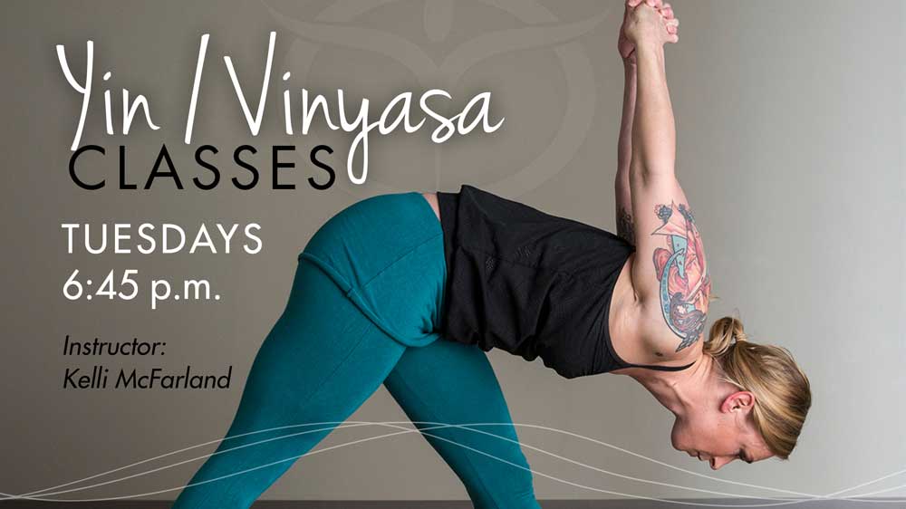
Interconnected motion lines — This visual element, representing the inter-connectedness of mind/body/spirit is used to provide depth. When paired with another more geometric element or elements, this more organic element can accent and enhance the design. The lines also communicate movement and flow. The lines are equal in weight, showing the importance of all three together, yet not always at the same place at the same time.