Jupiterhill Creative

Jupiterhill Creative

JupiterHill Creative specializes in wedding design, planning and management. They plan the entire affair from crafting a budget, choosing a venue, scheduling dress fittings, designing invitations and planning the honeymoon or just manage the big day so that the family can relax and enjoy being in the moment.

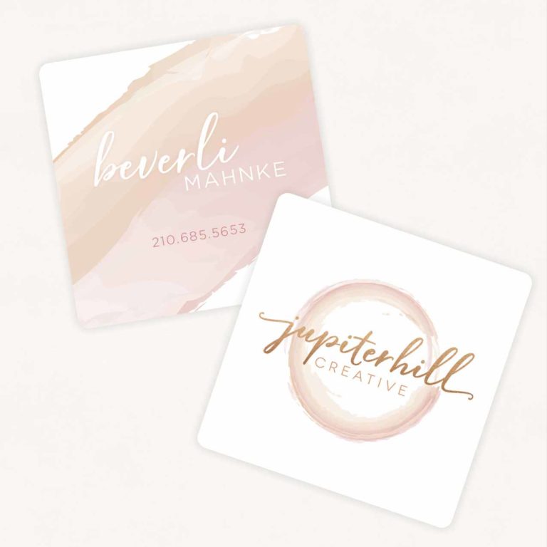
Their logo was designed to feature the creative aspect of wedding planning, while also thinking outside of the box. The two colors emphasize the couple’s individual tastes and interests, but intertwined in the shape of the ring, the symbol for eternal love.

BACK TO PORTFOLIO

Leon Bronstein

Leon Bronstein exHibition catalog

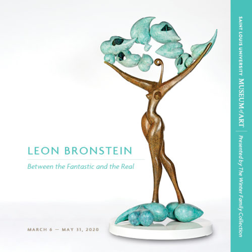
It was a joy to be able to look at Leon’s sculptures while putting together this catalog for an exhibition at Saint Louis University Museum of Art. The book features themed sections which are divided by a ‘warm and happy’ color palette as requested by the artist to represent the direction his current work is taking him. The main colors chosen for the covers were inspired by the bronze material and green patina on Leon’s work. The fonts used are organic and clean, but with some movement. The page layout is such that it leaves open space for exploration.


Sherdonna

SHERDONNA

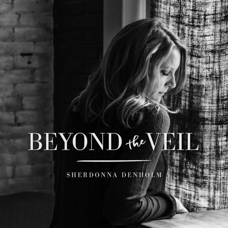
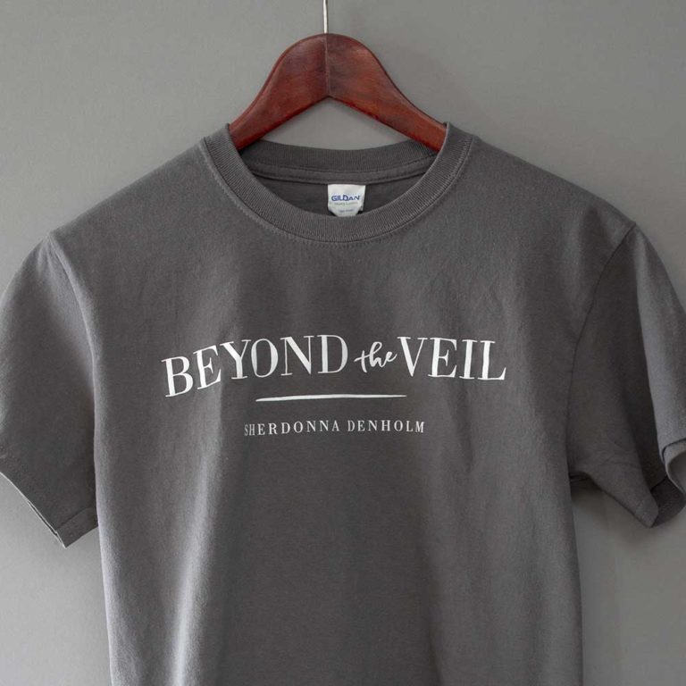
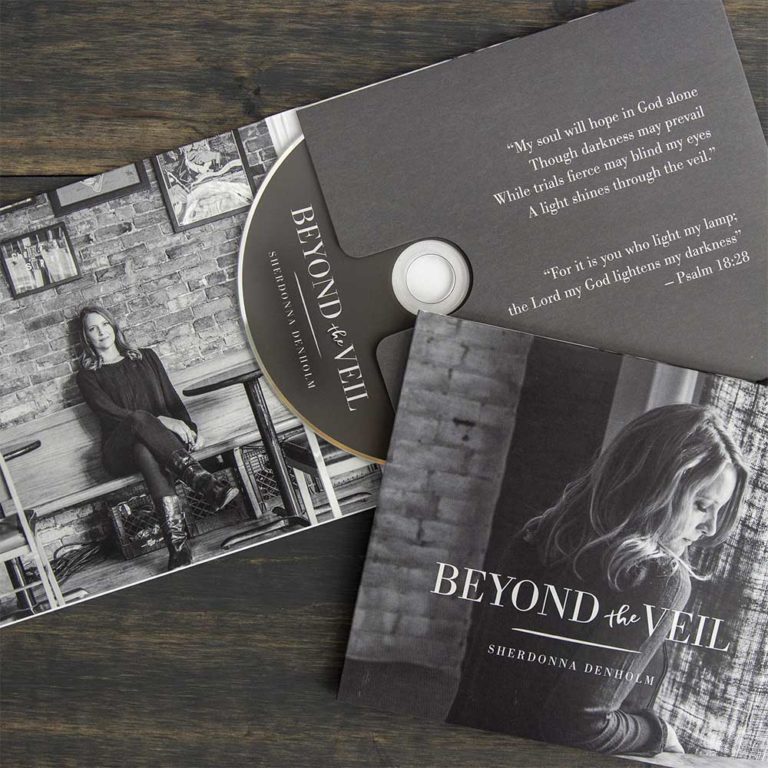
Sherdonna came to us with several ideas for the look and feel of her new album. Ultimately it was the portrait photography (Natalie Ulrich) that led the direction of the project. One of the shots fit perfectly with the album’s title song, playing with shadows and light. We then used a text treatment for the album logo in a modern serif interrupted by a more casual handwritten script that fit the tone of the album. All merchandising reflected the shades of gray and font style for consistency.

BACK TO PORTFOLIO

Cignal

Cignal Systems, Inc.

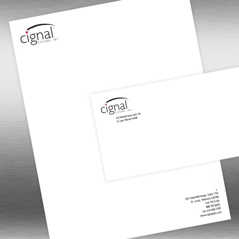
An audio/video/lighting design and integration company, Cignal Systems needed a logo that stood apart from the tech-based competition, showing not only proven technical expertise but also conveying the innovative and architectural way in which designs were implemented … creative solutions that artfully co-exist within their environment.

BACK TO PORTFOLIO

Treats Unleashed

treats unleashed

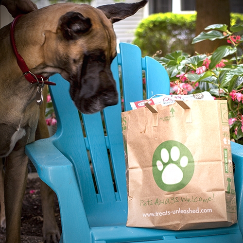
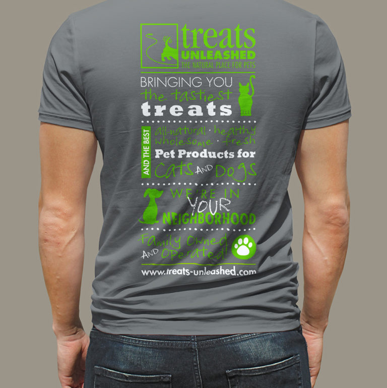
Treats Unleashed came to us with a fairly established brand; it just needed a refresh and some help with consistency. After nailing down the color palette, fonts and other brand elements, we created shopping bags, flyers, store signage, print and digital ads, website banners, graphics for eNewsletters, t-shirts and packaging for their private label grooming products.

BACK TO PORTFOLIO

Tappmeyer House

Tappmeyer House

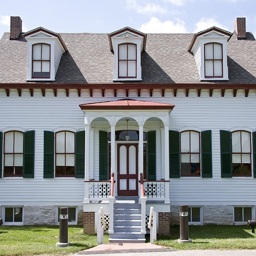
As fundraising continued to preserve the 140-year-old Tappmeyer House, the Tappmeyer Foundation wanted to place eye-catching donation boxes in local businesses to further the cause. We designed the donation box to resemble the actual Tappmeyer house which sparked interest and conversation. After more than $400,000 was raised, the Tappmeyer house now sits in its new location, Millennium Park in Creve Coeur, Mo and continues to be part of history.

BACK TO PORTFOLIO

Studio09

Studio09

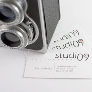
A clever play on the type of business (photography studio) and location (09, the last two digits of a trendy zip code in the San Antonio area), studi09 needed to stand out from their competition. We designed a clean and current logo which read as one word but succinctly stated what they do as well as where they are located.

BACK TO PORTFOLIO

Auxano: Recriprocal Ministries International (RMI)

RMI’s goal was to communicate a partnership connecting the churches in North America to the communities in Haiti, with RMI serving as the conduit between them—enabling and driving the partnership. We addressed this by designing a bridge through the letters of the logo utilizing negative space. The letters for RMI are a bold sans serif font to represent strength, but also in italics, symbolizing movement and momentum. The phrase “Life transforming” is used to reinforce the end result of their vision with two different style options: one being that of transparency in the shape of curve, which conveys motion and change; the second, a graduated screen, signaling transformation with its use of color that morphs from blue to green. Bridge arches were designed to be used in different ways to reinforce the bridge within the RMI logo, signaling partnership. Additionally, a row of photos can be formed in the shape of the bridge arch. The use of texture also adds depth and dimension to the visual identity and communicates the on-the-ground work necessary to build and bridge partnerships between North American churches and Haitian communities. Photographic style further communicates the partnership showing both the effort and results a partnership can yield. All of these elements combine to reinforce RMI’s vision, purpose and proven results.

Continue reading